Category
Web Design
Publish Date
06 Jun 2026
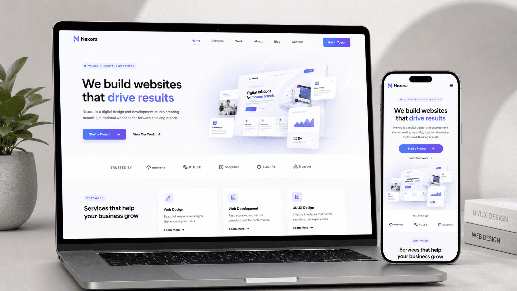
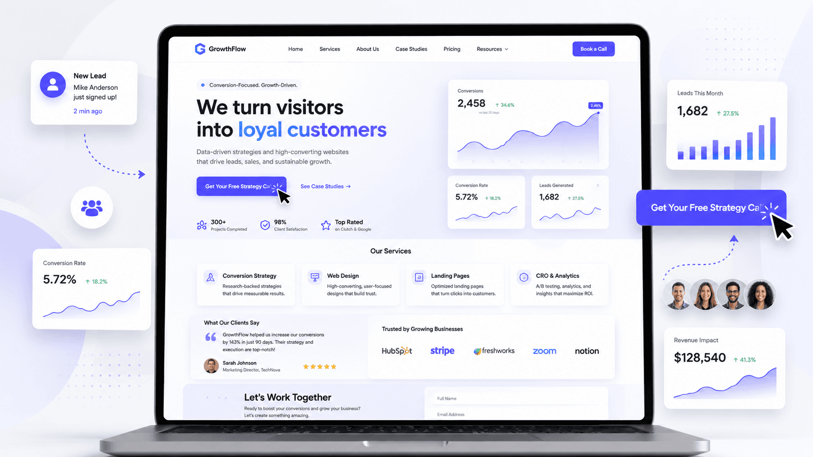
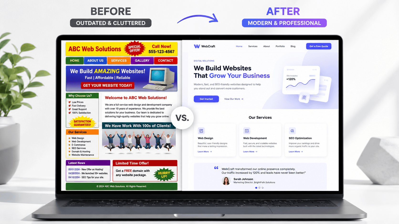
Most people think a presentation website only needs to “look good.” But in 2026, that is no longer enough. A modern website needs to build trust, explain your offer clearly, load fast, work perfectly on mobile, and guide visitors toward taking action.
In this article, you will learn what a modern presentation website should include in 2026, why each section matters, and how a better website structure can help a business attract more clients.
What Should a Modern Presentation Website Include in 2026?
A presentation website is often the first serious interaction between a potential client and a business.
Before someone calls you, visits your location, books a service, or sends a message, they usually check your website. And in just a few seconds, they decide if your business feels professional, trustworthy, and relevant.
That is why a modern presentation website in 2026 should not be treated like a simple online brochure. It should work as a digital sales tool.
A good website does more than display information. It explains what you do, who you help, why people should trust you, and what action they should take next.
Below are the most important elements every modern presentation website should include in 2026.
1. A Clear Hero Section
The hero section is the first thing people see when they land on your website.
This section should instantly answer three questions:
What do you offer?
Who is it for?
What should the visitor do next?
A modern hero section should include:
A clear headline
A short supporting description
One main call-to-action button
A strong visual element
A clean and uncluttered layout
For example, instead of using a generic headline like:
“We help businesses grow”
a better version would be:
“Modern websites for businesses that want more clients”
This is more specific, easier to understand, and focused on the result.
Your hero section should not confuse people. It should make them immediately understand what your business does.
2. A Strong Value Proposition
A value proposition explains why someone should choose you instead of another option.
Many websites talk too much about the company and not enough about the client’s problem. In 2026, your website needs to communicate value quickly.
A strong value proposition should explain:
What problem you solve
What result you create
What makes your service different
Why the visitor should trust you
For example, if you are creating websites for local businesses, your value proposition could focus on helping them look more professional, get more inquiries, and make it easier for customers to contact them.
People do not just buy a website. They buy clarity, trust, visibility, and results.
3. Simple and Intuitive Navigation
Navigation should help users move through the website without thinking too much.
A modern presentation website does not need a complicated menu. In most cases, simple navigation works best.
Important navigation links may include:
Home
About
Services
Portfolio
Process
Testimonials
Contact
The goal is to make the website feel easy to use. If visitors cannot find what they need quickly, they may leave.
A clean navigation bar also makes the website feel more professional and organized.
4. Mobile-First Responsive Design
A modern website must work beautifully on all screen sizes.
In 2026, users visit websites from phones, tablets, laptops, and large desktop monitors. This means your design should not only look good on desktop. It should also be easy to read and use on mobile.
A mobile-friendly website should have:
Readable text
Buttons that are easy to tap
Sections that stack naturally
Fast loading speed
Images optimized for smaller screens
No broken layouts
Mobile responsiveness is not optional anymore. It is a basic requirement for a professional website.
If the mobile version feels unfinished, the whole brand can feel less trustworthy.
5. Fast Loading Speed and Good Performance
A beautiful website is not enough if it loads slowly.
Website speed affects user experience, trust, and conversions. If visitors have to wait too long, many of them will leave before they even see your offer.
A modern website should be optimized for performance by using:
Compressed images
Clean structure
Optimized animations
Fast hosting
Minimal unnecessary scripts
Proper image formats
Efficient page layout
Performance is especially important for presentation websites because their job is to quickly communicate value.
The faster someone understands your offer, the higher the chance they will take action.
6. Clear Services Section
A presentation website should clearly explain what the business offers.
The services section should not be vague. It should help visitors understand exactly how the business can help them.
A good services section may include:
Service name
Short description
Main benefits
Who the service is for
A call-to-action
For example, instead of writing:
“Web Design”
you can write:
“Custom Website Design — modern, responsive websites designed to help your business look professional and attract more clients.”
This version explains both the service and the benefit.
Clarity sells better than complicated language.
7. Trust Elements
Trust is one of the most important parts of a modern website.
Visitors need reasons to believe that your business is real, professional, and capable of delivering results.
Trust elements can include:
Testimonials
Client logos
Case studies
Before and after examples
Certifications
Years of experience
Real photos
Social proof
Reviews
A website without trust elements can feel empty, even if the design looks good.
People want proof. They want to see that others have worked with you and had a good experience.
8. A Portfolio or Case Studies Section
For service-based businesses, a portfolio can be extremely powerful.
A portfolio shows your work instead of only talking about it. It helps potential clients imagine what you could do for them.
A modern portfolio section should include:
High-quality project images
Short project descriptions
The problem you solved
The solution you created
The final result
A link to view more details
Case studies are even better than simple project images because they explain your thinking process.
They show that your work is not just visual, but strategic.
9. A Clear About Section
The about section should make the business feel more human.
Many people make the mistake of writing an about section that is too formal or too generic. A good about section should create connection and trust.
It can include:
Who you are
What you do
Who you help
Why you do it
What your approach is
A professional photo or brand image
People like to know who is behind a business. This is especially important for freelancers, agencies, consultants, and local companies.
A strong about section can make the visitor feel more comfortable contacting you.
10. A Simple Process Section
A process section helps potential clients understand what happens after they contact you.
This reduces uncertainty.
For example, a web design process could look like this:
Discovery call
Strategy and structure
Design in Figma
Website development in Framer
Responsive optimization
Launch and support
When people understand your process, they feel more confident working with you.
A clear process also makes your service look more professional and organized.
11. Strong Call-to-Action Buttons
A modern website needs clear call-to-action buttons.
A call-to-action tells visitors what to do next. Without it, people may read your website and leave without taking action.
Examples of strong CTAs:
Book a Free Call
Request a Website Audit
Start a Project
View My Work
Get a Quote
Contact Me
Every important section should naturally guide users toward the next step.
The best call-to-action is clear, specific, and easy to find.
12. Professional Visual Design
Visual design matters because people judge a business very quickly based on how the website looks.
A modern presentation website should feel clean, consistent, and professional.
Good visual design includes:
Consistent colors
Clear typography
Balanced spacing
High-quality images
Modern UI elements
Simple layouts
Good contrast
Visual hierarchy
The goal is not to add as many effects as possible. The goal is to make the website easy to understand and pleasant to use.
A modern website should feel intentional, not overcrowded.
13. Accessibility and Readability
A website should be easy to use for as many people as possible.
Accessibility means designing and building the website so that people with different needs can still use it properly.
This includes:
Good text contrast
Readable font sizes
Keyboard-friendly navigation
Alt text for images
Clear buttons and links
Simple language
Logical page structure
Accessibility is not only a technical detail. It improves the experience for everyone.
A website that is easier to read and navigate will usually perform better.
14. SEO-Friendly Structure
A modern presentation website should also be easy for search engines to understand.
SEO does not mean only adding keywords. It also means creating a clear structure and useful content.
An SEO-friendly website should include:
Proper headings
Clear page titles
Meta descriptions
Optimized images
Internal links
Fast loading speed
Relevant keywords
Useful content
Clean URLs
For example, a business that offers web design services should have clear pages and sections around its services, process, portfolio, and contact information.
Good SEO starts with clarity.
If users understand your website easily, search engines usually can too.
15. A Contact Section That Makes Action Easy
The contact section is one of the most important parts of a presentation website.
If someone is ready to contact you, the process should be simple.
A good contact section can include:
Contact form
Email address
Phone number
Location
Social media links
Calendar booking link
Short message explaining what happens next
The easier it is to contact you, the better.
Do not make visitors search for your contact details. Place them clearly and make the next step obvious.
16. Subtle Animations and Interactions
Modern websites often use animations, but they should be used carefully.
Animations should improve the experience, not distract from the message.
Good examples include:
Smooth section reveals
Button hover effects
Subtle transitions
Interactive cards
Light motion on scroll
Micro-interactions
The key word is subtle.
Too many animations can make a website feel slow, confusing, or unprofessional. The best animations support the content and make the website feel more polished.
17. Real Content, Not Generic Text
A modern website should not feel like it was filled with random placeholder text.
The content needs to speak directly to the target audience.
Good website copy should be:
Clear
Specific
Easy to read
Focused on benefits
Written for the client
Free of unnecessary jargon
Instead of saying:
“We provide innovative digital solutions”
say something more direct:
“We design modern websites that help small businesses look professional and get more client inquiries.”
Specific copy is easier to trust.
Conclusion
A modern presentation website in 2026 needs to do more than look beautiful.
It needs to be clear, fast, responsive, trustworthy, accessible, and focused on conversion.
The most important elements are:
A clear hero section
A strong value proposition
Simple navigation
Mobile-first design
Fast performance
Clear services
Trust elements
Portfolio or case studies
A human about section
A simple process
Strong call-to-action buttons
Professional visual design
Accessibility
SEO-friendly structure
An easy contact section
A good website should guide visitors from curiosity to trust, and from trust to action.
If your current website only looks good but does not explain your value clearly, it may be time to rethink its structure.
Your website should not just exist online.
It should help your business grow.